Anchorage Digital
Senior Product Designer · Aug 2021 - Sep 2023
Skills used: Product design, UI/UX, Branding, User research, prototyping | URL: anchorage.com
Examples: Figma
Anchorage is a digital asset platform for institutions. As the third in-house designer, I helped build the design system and designed cross-platform experiences in transacting, lending, governance, transparency and more. Experienced growth from 150 to 500 employees.
Designing for institutional crypto is a different discipline than consumer fintech. The users are hedge funds, protocols, and corporate treasuries moving very large sums, and a single misread screen can be catastrophic and irreversible. Anchorage is also a federally chartered digital asset bank, so the work sits inside real regulatory obligations rather than product preference. That inverts a lot of ordinary design instinct: speed and minimalism matter far less than certainty, and it is usually correct to add a confirmation step rather than remove one.
Joining as the third designer meant the job was never only the screen in front of me. I was simultaneously shipping features and building the foundations the team would rely on as it scaled, during a period when the company more than tripled in headcount. I worked across product, engineering, compliance, and client-facing teams, and a lot of my value came from translating genuinely complex financial and cryptographic concepts into interfaces an operator could act on confidently under time pressure.
Design System
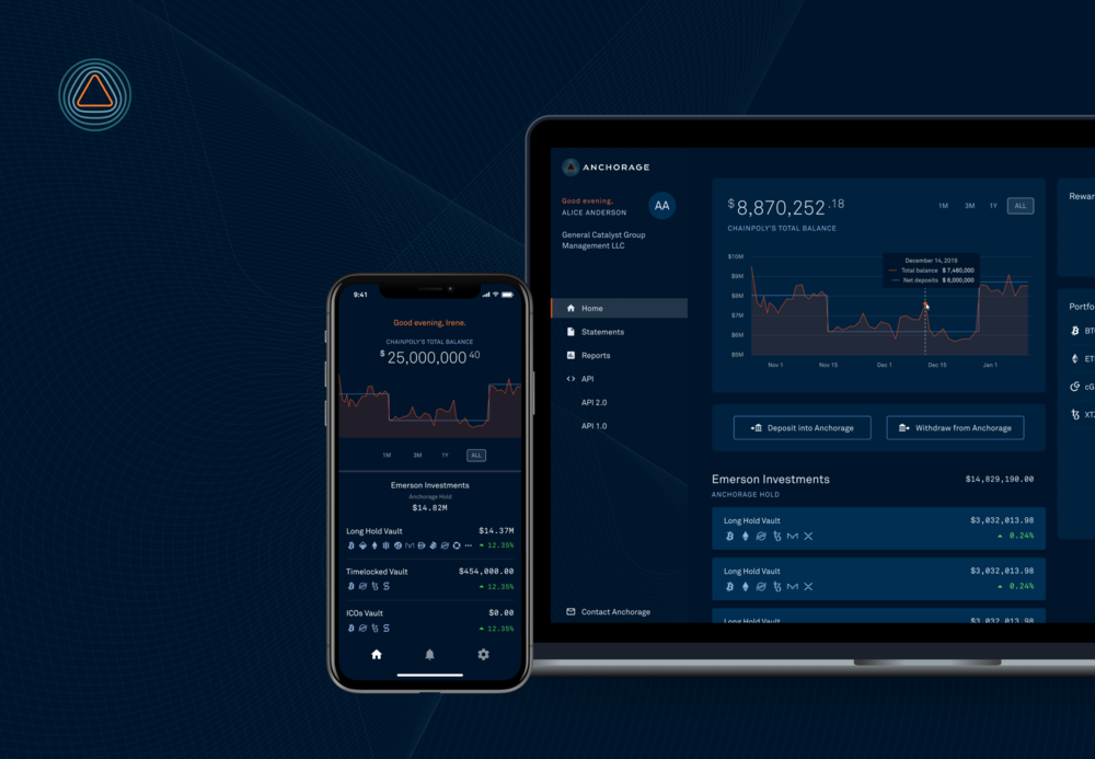
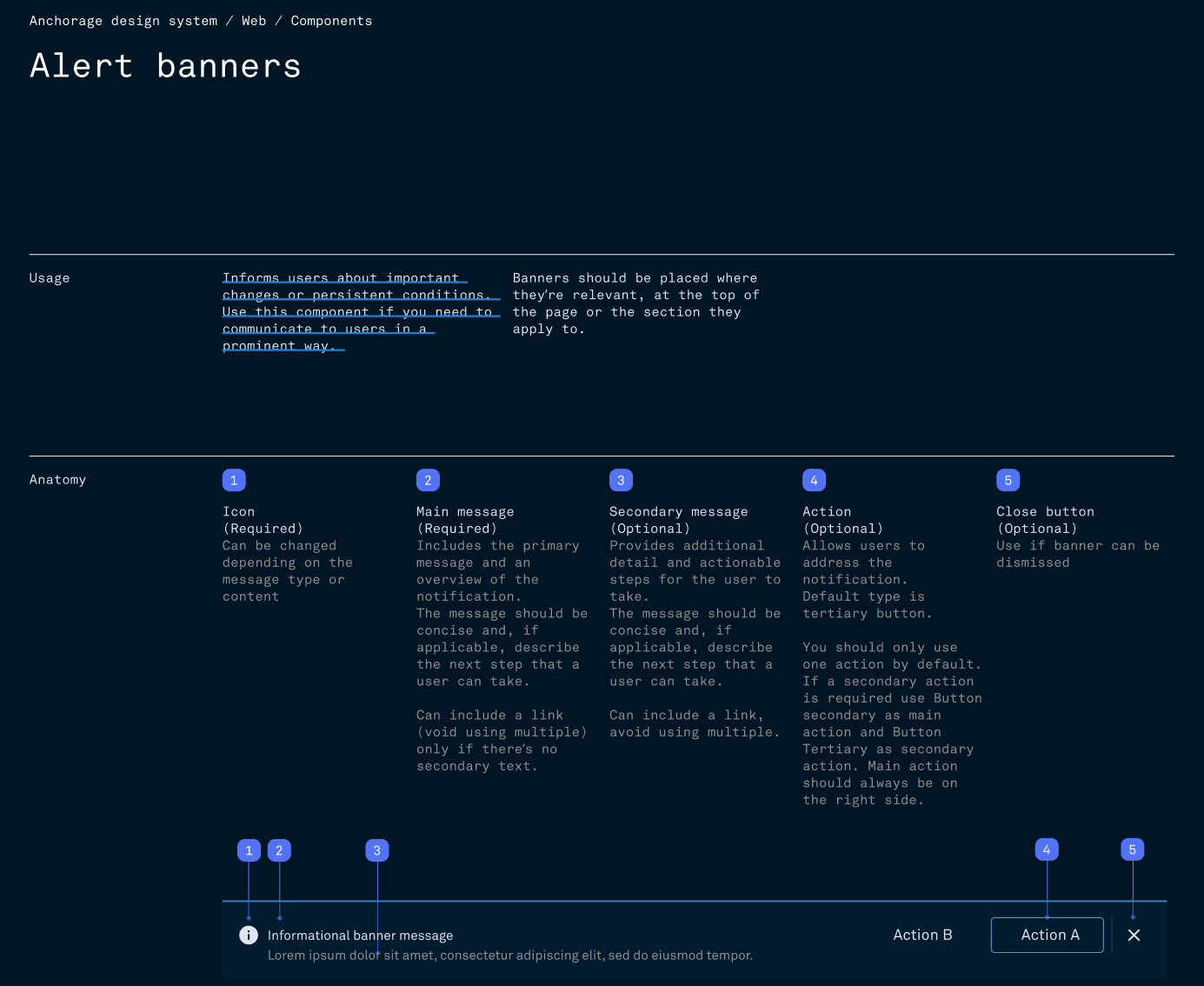
While creating the design system we wanted to focus on three primary themes: Transparency, Humanity, and Personalization. As well as two primary principles: Security First and Users being in Control.
Those were not decorative values, they were tiebreakers. Security First meant that when a safer flow and a faster flow conflicted, the safer one won, and we spent our design effort making it feel considered rather than obstructive. Users being in Control meant never hiding what was actually happening to someone's assets behind a friendly abstraction, since in this context reassurance that turns out to be wrong destroys trust permanently. Transparency and Humanity pushed against the instinct to let the interface become as cold and dense as the underlying infrastructure.
Practically, the system had to serve teams shipping across web and iOS at increasing speed without every team reinventing patterns for the same high-stakes moments. I focused on getting the components around review, approval, and confirmation genuinely right, because those are the points where an error is unrecoverable, and then documenting the reasoning so designers joining later inherited the intent and not just the assets.
NFT Custody
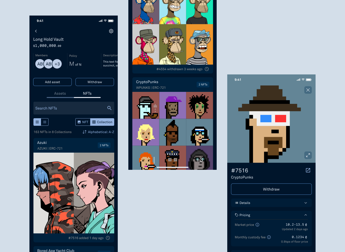
Anchorage was the first institutional custodian to offer NFT support. I worked to create an easy to use and beautiful UI to allow our clients easy access to their NFT collections while maintaining our trademark security that is so important to every one of our clients. There were several challenges in this project including how to display and when to display certain information.
The core tension was that every other pattern for displaying an NFT was built for consumers, where the artwork is the product and the interface exists to show it off. Institutional custody is the opposite: the client is holding an asset they need to verify, value, and account for, and an interface that leads with a large image is actively unhelpful. At the same time, stripping it down to rows in a ledger throws away information that genuinely matters for authenticity.
I resolved it by treating the artwork as evidence rather than decoration, pairing it with provenance, contract, and collection details at the same level of prominence so a client could confirm they held the specific asset they believed they held. Being first to market also meant there was no established pattern to borrow and no user expectation to meet, so decisions had to be argued from principles rather than convention, and validated with clients directly.
Client policies and permissions
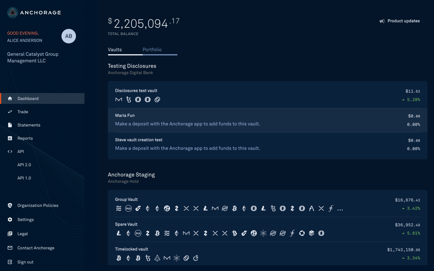
As Anchorage continued to grow and its client base moved to be more complex, sophisticated and mature institutions, we continued to learn about the ways clients wanted to use our platform and the structure we could create to better meet their needs. This initiative included several projects that would allow client organizations to better and more granularly manage policies and permissions across their vaults, users, assets and different operations. I worked on many of them including and mainly the iOS app updates and Client Dashboard.
This was the hardest design problem I worked on at Anchorage. Permissions are genuinely complex, and the complexity is not artificial: a client might legitimately require that two named people approve any transfer above a threshold, from a specific vault, during business hours. The temptation is to expose that complexity directly as a wall of configuration, which is technically complete and effectively unusable.
My approach was to design around what an administrator is actually trying to express, which is a policy in plain language, and then make the interface render the consequences of that policy back to them clearly. Equally important was the other side of it: the person subject to a policy needs to understand instantly why an action is blocked and what has to happen to unblock it, otherwise support absorbs the cost. Getting this right mattered commercially, because sophisticated institutions will not move significant assets onto a platform that cannot model their internal controls.