Avail
Senior Product Designer · May 2019 - Aug 2021
Skills used: Product design, UI/UX, Branding, Product management, User Research, Marketing, Team management | URL: availcarsharing.com
Avail was a car sharing venture incubated inside Allstate, which made it an unusual place to design. It had to behave like a startup to compete, while carrying the expectations and risk tolerance of a large insurance company. I joined as the first internal product designer after an outside consultancy had delivered the initial MVP, so an early part of the job was taking ownership of work I had not authored, understanding why it had been built that way, and deciding what to keep. Over time the role expanded well past product design into research, marketing surfaces, and managing other designers.
The underlying business problem was trust in both directions. Avail asked owners to hand over their personal vehicle and renters to drive a stranger's car, which only works if both sides believe the process is safe and someone credible is standing behind it. That shaped nearly every decision, because the Allstate relationship was simultaneously the biggest asset for credibility and the biggest liability for feeling like an approachable, modern service.
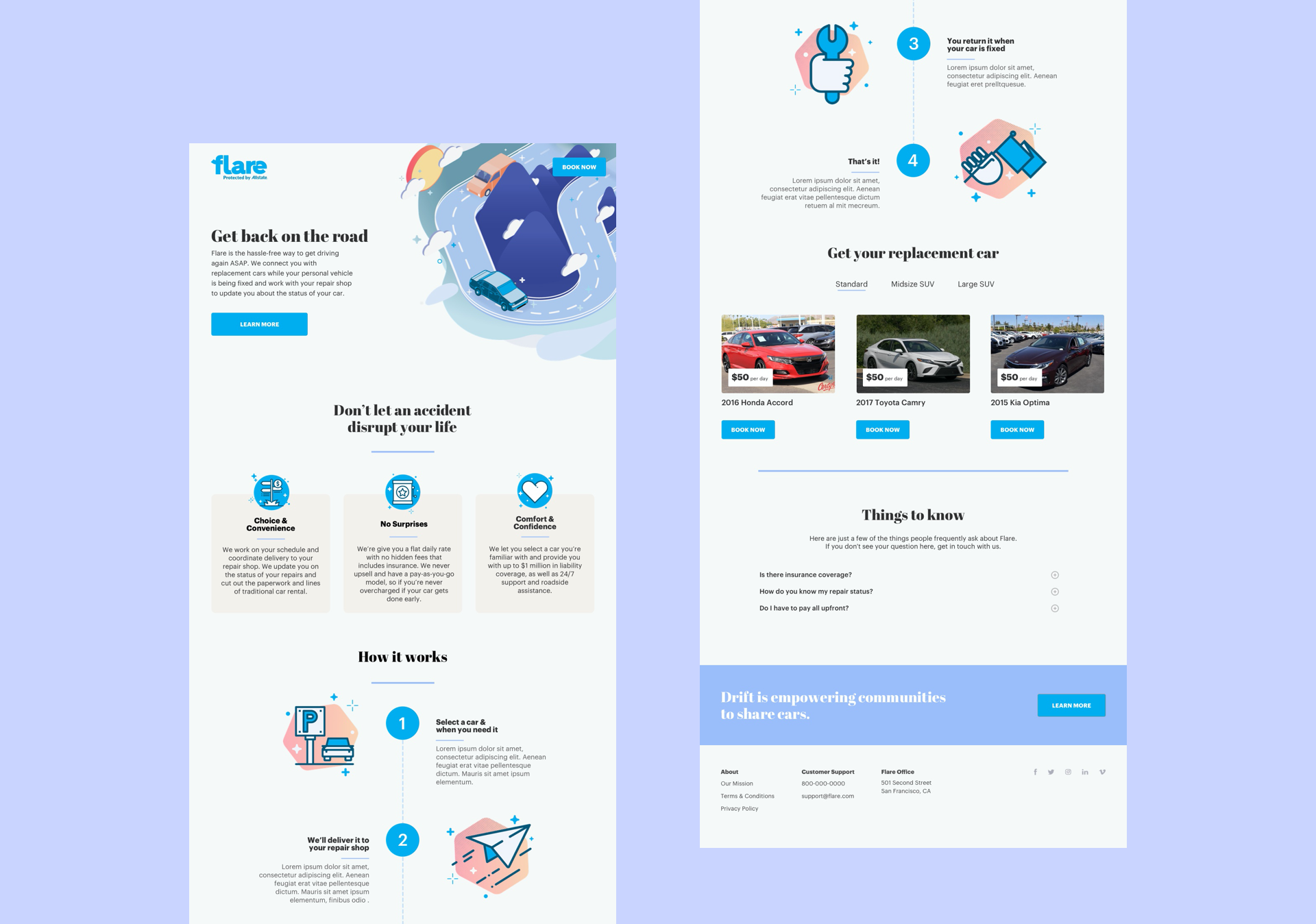
Avail about us page
My first major project at Avail was to design the About Us page. As a subsidiary of Allstate, one of the challenges with the About Us page and the brand, in general, was how to humanize it. We wanted Avail to feel like a welcoming and scrappy startup. One of the ways we achieved this was by including pictures of our lot staff and photos taken by our users. The center design was eventually chosen after we A/B tested the three. We found that that design felt both the most welcome and informative to the user.
Using real photography of our own lot staff and genuine user submissions was a deliberate rejection of stock imagery, which reads as corporate immediately and would have undercut exactly the quality we were trying to establish. Showing the actual people who would hand you your keys made the service feel staffed by humans rather than administered by an insurer.
Running it as a three-way A/B test rather than arguing it out internally mattered just as much. Brand perception is the kind of question where senior stakeholders all have confident and conflicting instincts, and an experiment converts that into evidence. It is also how I prefer to resolve subjective disagreements generally: put the options in front of real users and let the result settle it.
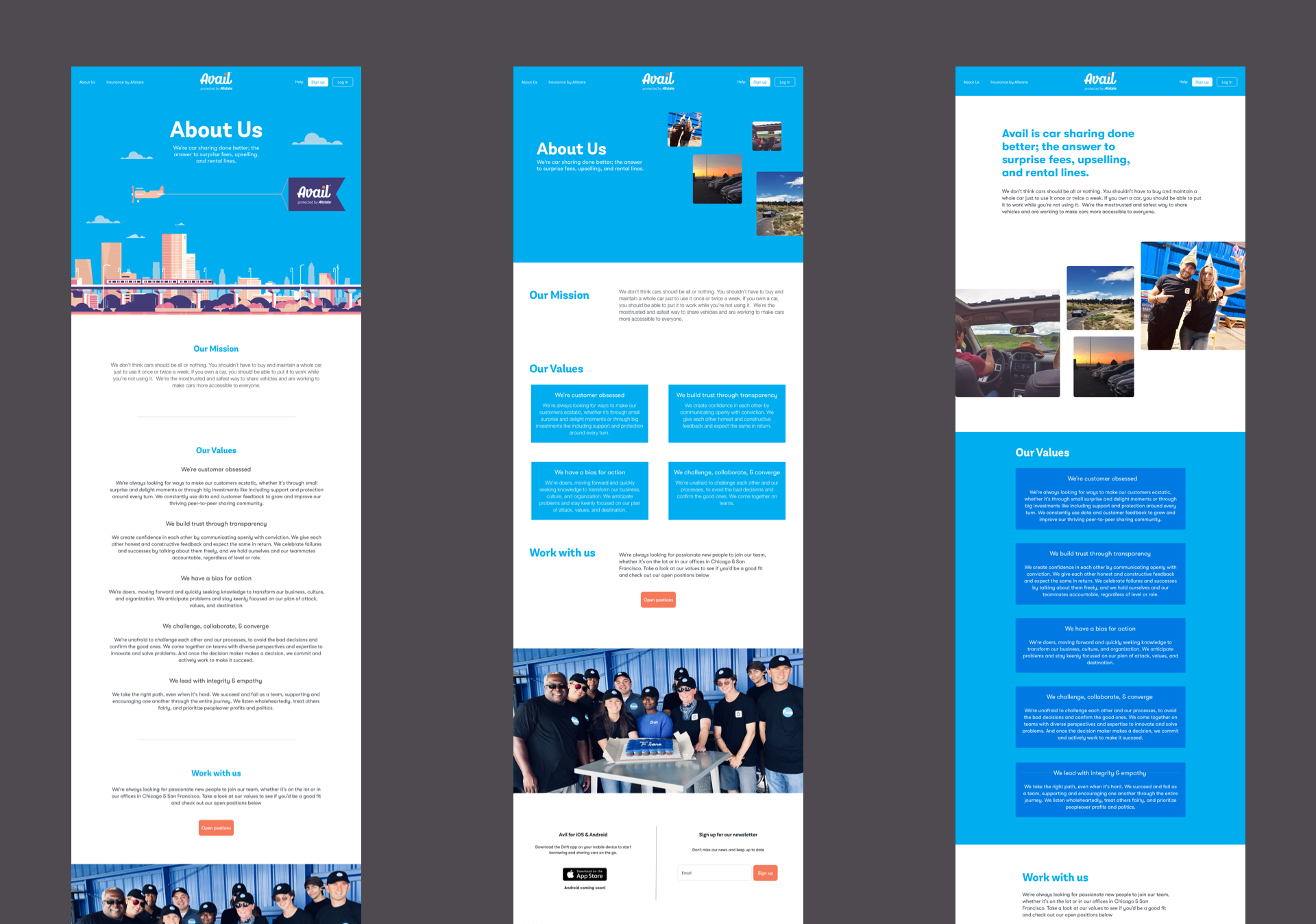
Flare landing page
Flare is a secondary program within Avail that was created as a way for Allstate insurance users to be quickly given replacement cars. At the same time, their vehicle is being repaired after an accident. To be able to quickly test the hypothesis that this would be a better system than the current one used by Allstate, I was tasked with making a simple, yet beautiful landing page that succinctly explained the concept and allowed users to book their replacement car all in one page.
What made Flare interesting was the emotional state of the user. Someone reaching this page has just been in an accident. They are stressed, probably dealing with an insurance claim, and they need a car immediately. That is not a person who will read marketing copy or explore a multi-step flow, so the entire page had to explain an unfamiliar concept and complete a booking before their patience ran out.
I kept it to a single page for that reason: explanation and action in the same place, with the booking always visible rather than waiting at the end of a scroll. Constraining it this way also served the business goal, since the point was to test a hypothesis cheaply before committing engineering to a full product. Designing the smallest thing that could produce a real answer is often more valuable than designing the complete version, and it is a trade-off I look for deliberately.