Lime
Founding Product Designer · July 2017 - May 2019
Skills used: Product design, UI/UX, Branding, Product management | URL: li.me
In July 2017 I was brought on as the first full-time designer at Lime (then Limebike). I led design for rider experience. I designed the entire flow and integration of Lime-E (electric bike), and Lime-S (electric scooters), wallet, Parked or Not, map and menu redesign, and most recently LimePods. My approach to design has evolved as I have grown with Lime. Several things have remained the same since my very first day, a strong commitment to always advocate for the user, maintaining a healthy relationship with product and engineering, and always speaking my mind.
Joining as the first designer meant there was no design function to inherit, so a large part of the job was establishing one: the visual language, the component library, the research habits, and the expectation that design would be involved before decisions were already made. I was hired when Lime was a bike share company and stayed through its transformation into a scooter company, which is one of the faster pivots I have worked through. Each new vehicle type was not a variation on the last, it changed unlock flow, pricing, safety requirements, and the map itself.
The defining constraint at Lime was that this is a product used outdoors, one-handed, in sunlight, often in a hurry, sometimes in an unfamiliar city, and always with a physical vehicle and real traffic involved. Mistakes have physical consequences, not just frustration. That pushed me toward large tap targets, high contrast, and flows that could be completed while standing next to a scooter rather than sitting comfortably with full attention. Operating across many cities with different regulations also meant the interface had to adapt to local rules without becoming a different product in each market.
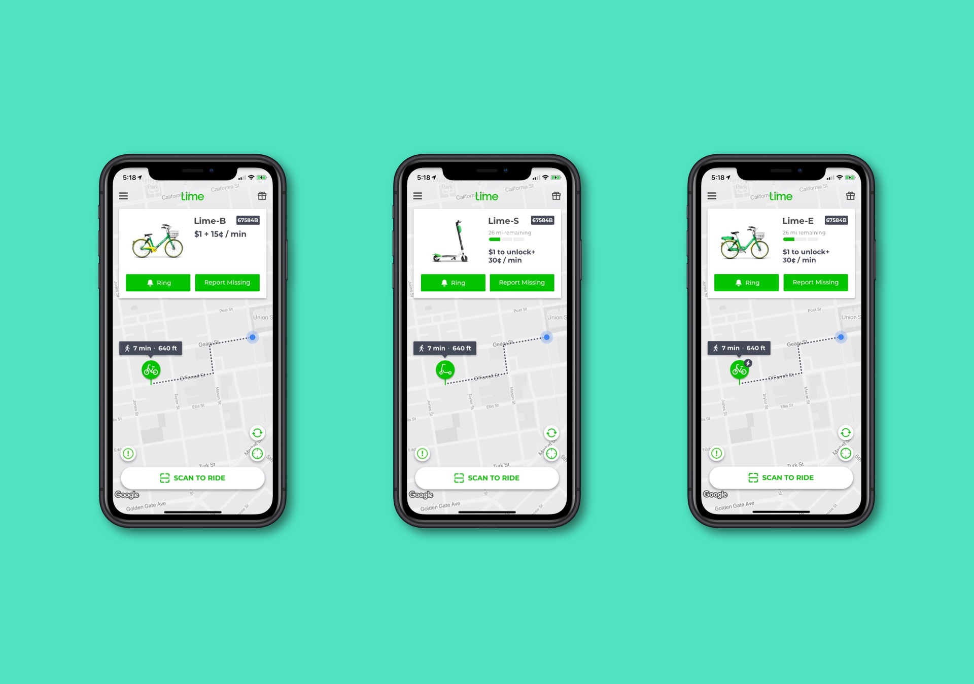
In August 2018 the mapview and menu designs were updated to simplify the user experience. The new design takes a minimalistic approach that allows for better screen usage and focuses on content. The gray-scaled map enables pins and zones to be more easily noticeable. Removing the navigation bar in the map view enables the map to take up the entire screen. The large titles used in menus push the content down the screen allowing for easier accessibility as phone designs continue to become larger and more elongated.
The map is the product for most riders, since the only question they usually have is whether there is a vehicle close enough to be worth walking to. The problem with the previous design was that the map was competing with itself. Standard map styling is full of color that is useful for navigation but meaningless here, and it was drowning out the only elements that mattered: available vehicles and the zones where you may or may not ride and park. Desaturating the base map was a subtractive decision that made the actionable layer immediately readable.
Pushing content down with large titles was an ergonomics decision rather than a stylistic one. Phones had grown well past comfortable one-handed reach, and riders are frequently holding something, standing at a curb, or wearing gloves. Anything requiring a stretch to the top of the screen is a poor choice in that context. Those two changes together are a good example of how I prefer to work: identify what the user is actually trying to do in the moment, then remove whatever is competing with it.
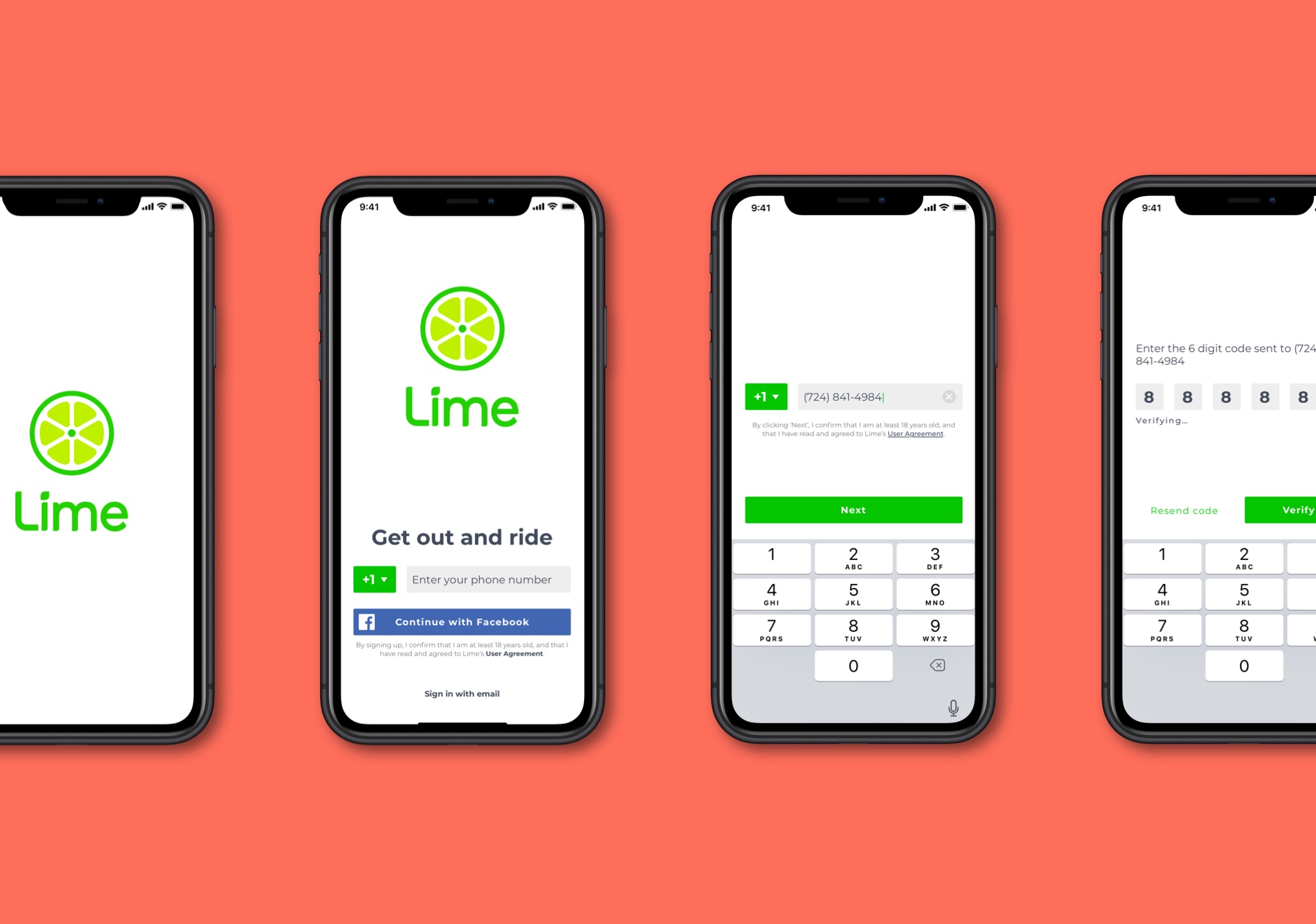
It was essential from the very beginning to keep the user experience as streamlined as possible. The first thing a user will see when initially using your app is almost always some sort of login/sign up flow. It's vital that this experience is as streamlined and painless as possible. The user should only be asked for the minimum necessary to get them onboarded. Anything else could leave a bad impression on them.
Onboarding carried unusual weight at Lime because of where it happens. A new rider is typically standing on a sidewalk next to a scooter they have already decided they want, often with friends waiting. Every additional field is a chance for them to give up and walk away, with the vehicle sitting right there. That is a much less forgiving context than someone signing up at home, and it justified fighting hard to defer anything that was not strictly required to take the first ride.
The complication was that this is a regulated, payment-taking service, so some requirements genuinely could not be removed. My approach was to sequence rather than delete: ask for what is legally and operationally necessary to unlock a vehicle, and move everything else to the point where it becomes relevant. Working through this with product, engineering, and legal to establish what was actually mandatory versus merely convenient to collect early was where most of the real progress came from.
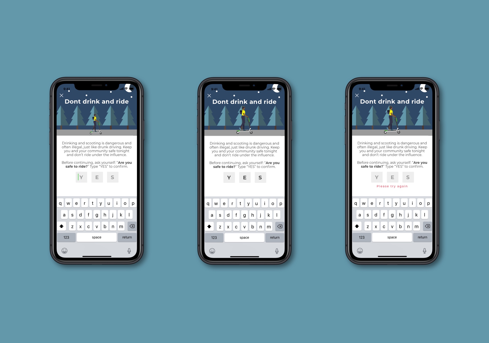
Many Lime riders are unaware that it is illegal in many areas we operate to use a scooter while intoxicated. I was tasked with figuring out how we can adequately educate our riders, and at the same time meet our legal requirements. It was crucial that in whatever way we tried to go about this issue that it remained on brand and did not feel like the rider was being scolded by a parent but rather being educated by a good friend.
This was the clearest example of a problem where the obvious solution is the wrong one. Legal exposure creates pressure toward a heavy warning and a required acknowledgement, which satisfies the lawyers and changes nobody's behavior, because a rider who has been drinking will tap through a wall of text faster than a sober one. Anything that reads as moralizing also gets dismissed immediately by exactly the audience it is aimed at.
I focused instead on timing and tone. A message lands differently late at night near a bar district than it does on a weekday commute, so contextual relevance does more work than repetition. The framing was peer-to-peer rather than institutional: a friend suggesting you walk or get a ride, not a company warning you about liability. The broader lesson I took from it is that safety features are judged on whether behavior actually changes, not on whether the warning was technically delivered, and designing for the first requires giving up the certainty of the second.
