Titan
Product Designer (Contract) · Dec 2020
Skills used: Product design, UI/UX, Branding | URL: titaninvest.com
Finished designs: Figma
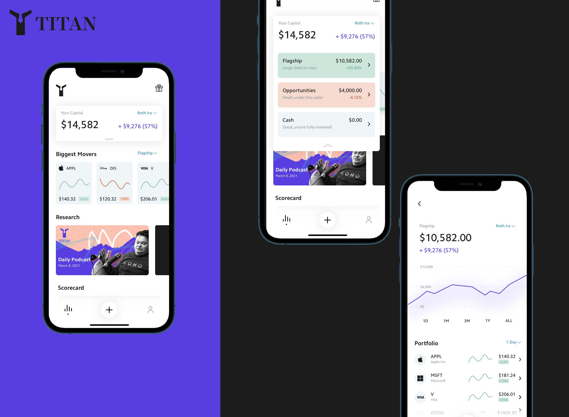
Titan is the first active investment manager built on consumer technology. Think: an elite asset manager in your pocket. Right now we have 20,000 users who have given us, cumulatively, nearly half a billion in assets. These assets are spread across two investment strategies - one is large cap stocks called Flagship. The other is small cap stocks called Opportunities. I was brought on as a contractor to help them redesign their app experience, design a notification inbox and explore their logo & branding.
Titan's positioning created a specific design tension. They were selling hedge fund style active management to retail investors through a phone app, which meant the product had to feel accessible enough for someone investing a modest amount, while projecting enough seriousness that handing over meaningful savings felt reasonable. Lean too consumer and it reads as a trading toy; lean too institutional and it becomes intimidating and boring. Nearly every decision across the app refresh, the notification inbox, and the branding was an attempt to hold both of those at once.
Coming in as a contractor on a defined engagement also shaped how I worked. There was no time to accumulate context slowly, so I front-loaded understanding what made Titan genuinely different from a robo-advisor, and concentrated effort on the areas where design could compound after I left. That is why the brand exploration and the inbox architecture mattered more than polishing individual screens.
Logo exploration
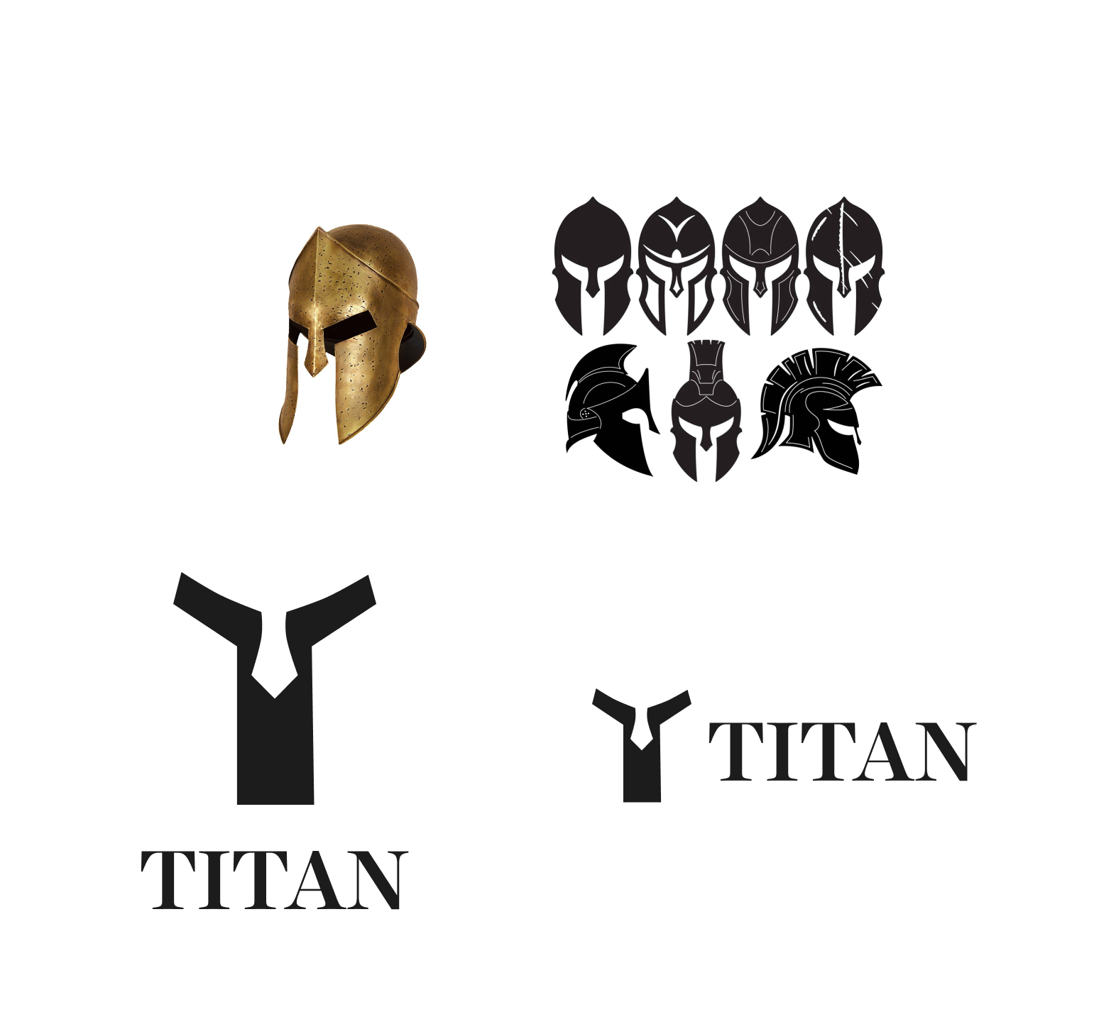
The current Titan logo came off as bland and uninspiring. I decided to lean into the Greek mythological background of the name for possible inspiration. Drawing from the negative space of ancient Greek hoplite helmets resembling an upper case, I created a simple yet easily recognizable logo. I also updated the font to the serif Harriet Display as many financial institutions use serif fonts to help portray things like tradition, assurance, safety, and respectability.
Notification inbox
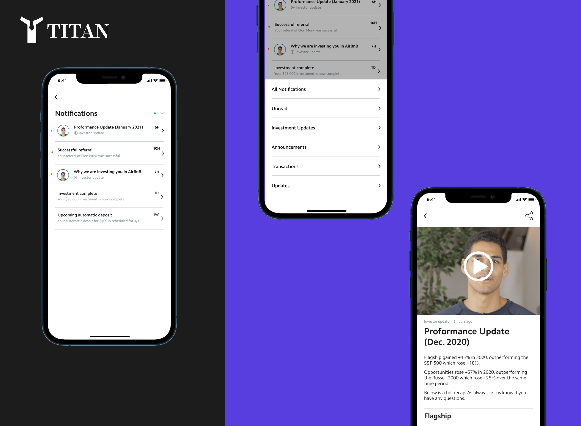
Titan's approach is to bring all users to the front row, which they love. They send in-app content explaining everything going on in real-time. For example, when they invested clients in Uber (Ticker:UBER), they sent them a 90-second video with the investment thesis, and a PDF with the full stock deep dive. I was tasked with creating an inbox screen that delightfully organizes the different types of content that Titan was sending to their user. Some of the challenges were what to prioritize / deprioritize visually. How should the information hierarchy be presented? And how this system would scale with dozens of messages?
On prioritization, I worked from the principle that urgency should be defined by consequence to the investor rather than by recency. A notification that your portfolio has been repositioned is categorically more important than a market commentary piece, even if the commentary arrived more recently, so the design gives weight to content that reflects an actual change to someone's money.
On hierarchy, the format is a signal in itself. A 90-second video, a written note, and a full deep dive PDF each imply a different level of commitment from the reader, and the inbox needed to make that legible before anyone tapped. Surfacing content type and length up front let users choose what to engage with based on the time they had, which is what makes a content-heavy inbox feel generous rather than demanding.
On scale, the honest answer was that an undifferentiated reverse-chronological list breaks down quickly once volume grows. Grouping by type and elevating unread items that carry portfolio consequences meant the screen stays useful at dozens of messages, and a user returning after a few weeks away can catch up on what materially changed without scrolling through everything they missed.